
CAJA
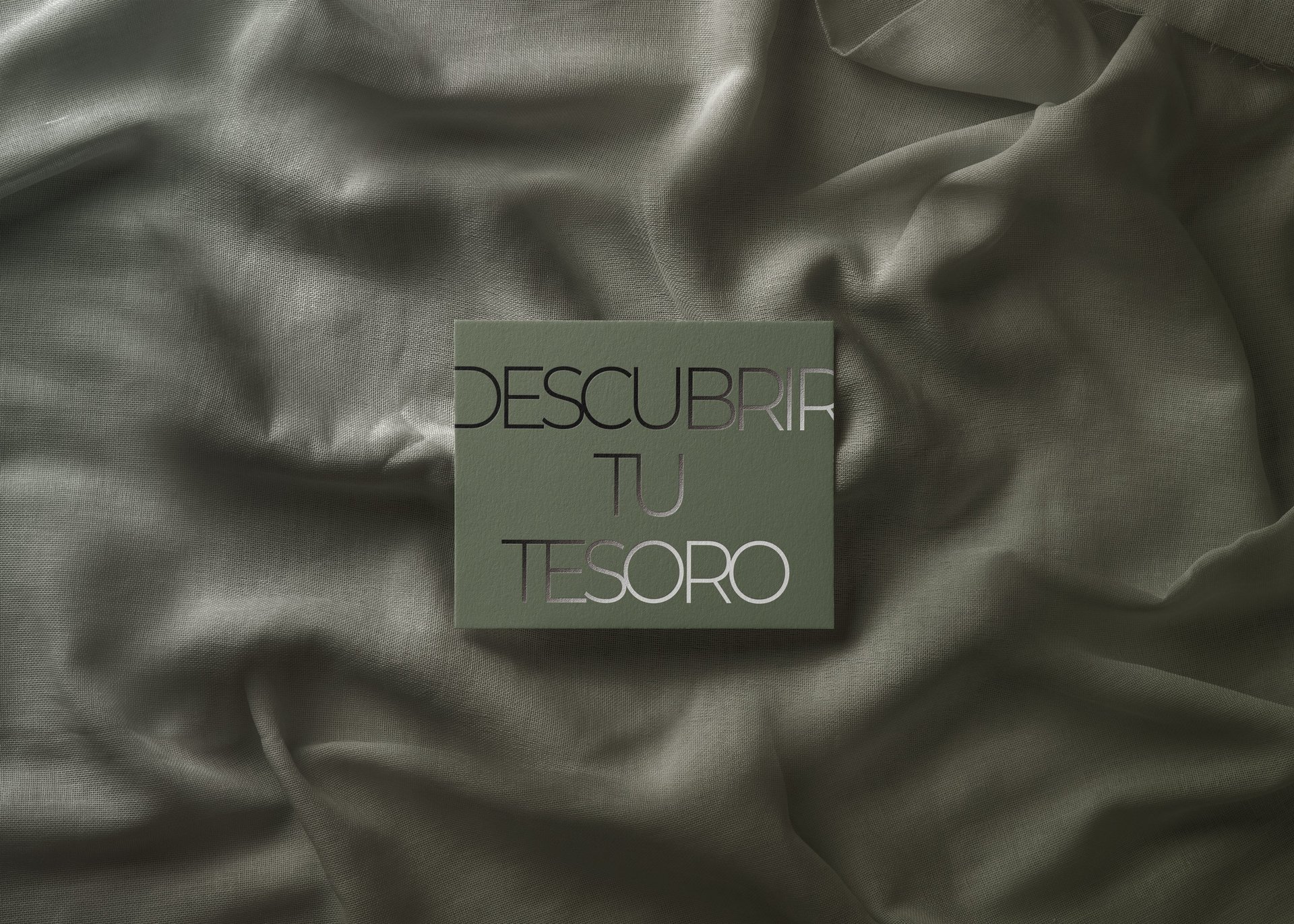
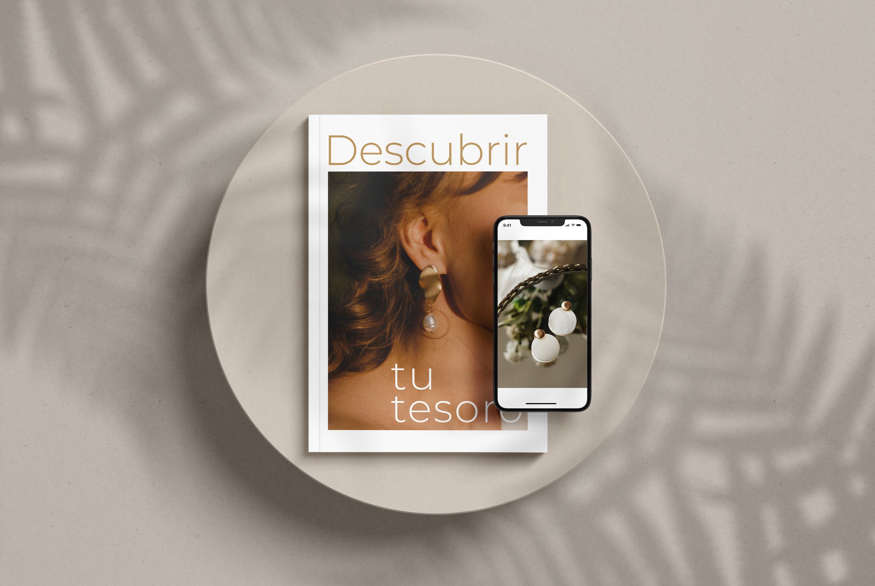
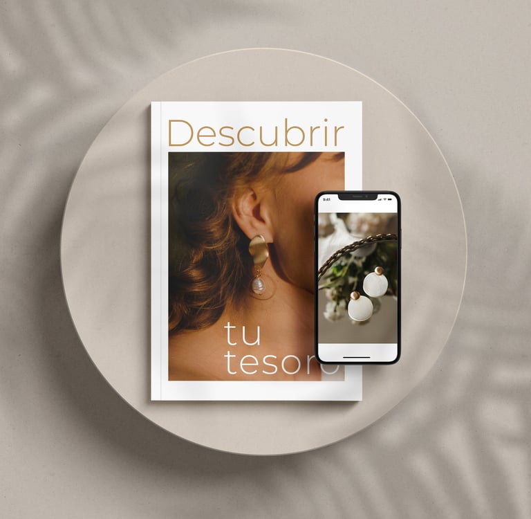
Discover Your Treasure
Spanish Jewelry House
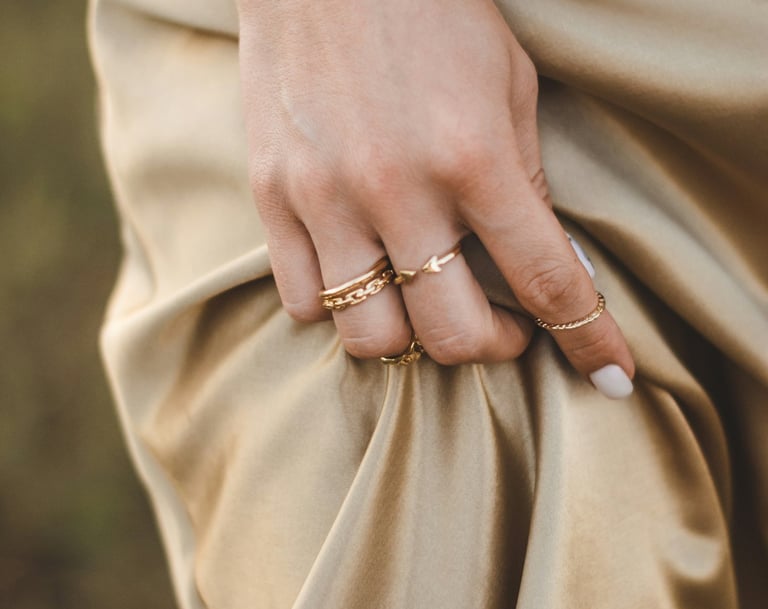
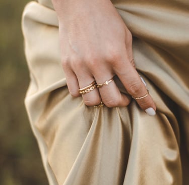
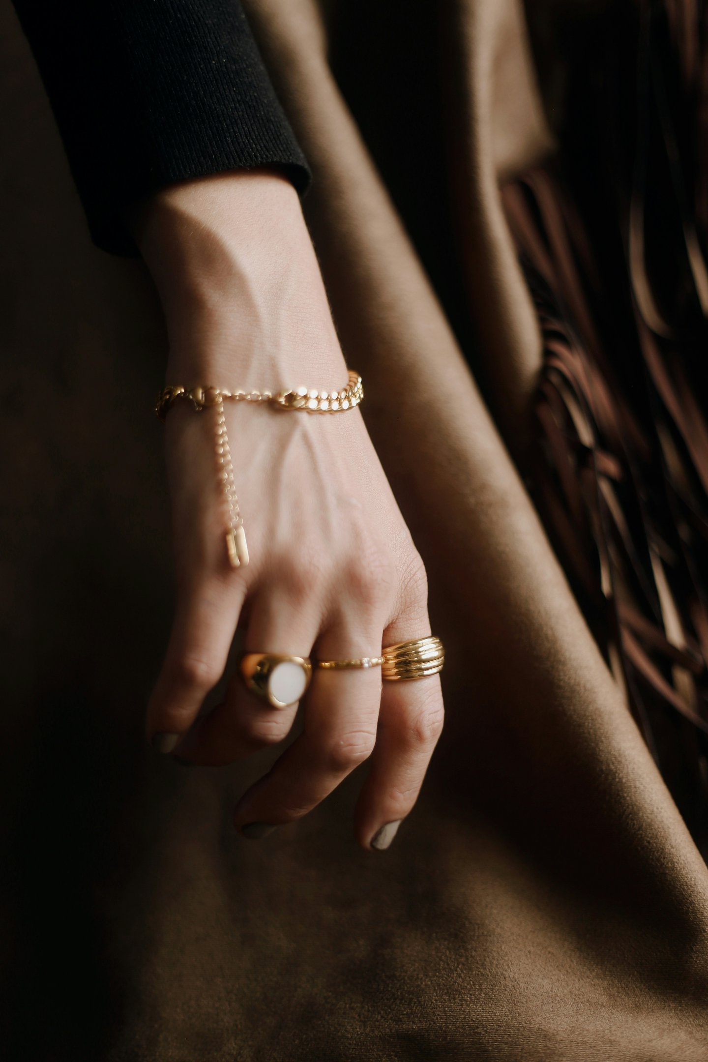
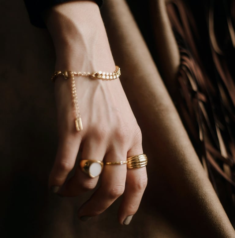
The Radiance of Gold
Caja was conceived around a single, powerful association — the glow of the Spanish sun reflected in gold. In Spain, sunlight is not simply weather; it is atmosphere, rhythm, and identity. It warms stone streets, touches architectural details, and turns gold into something alive rather than static.
This sensation became the emotional foundation of the brand. Gold is interpreted not as a symbol of status alone, but as captured sunlight — intimate, wearable, personal. The visual identity had to translate this radiance into a restrained and sophisticated language that feels warm without becoming decorative, luminous without becoming loud.
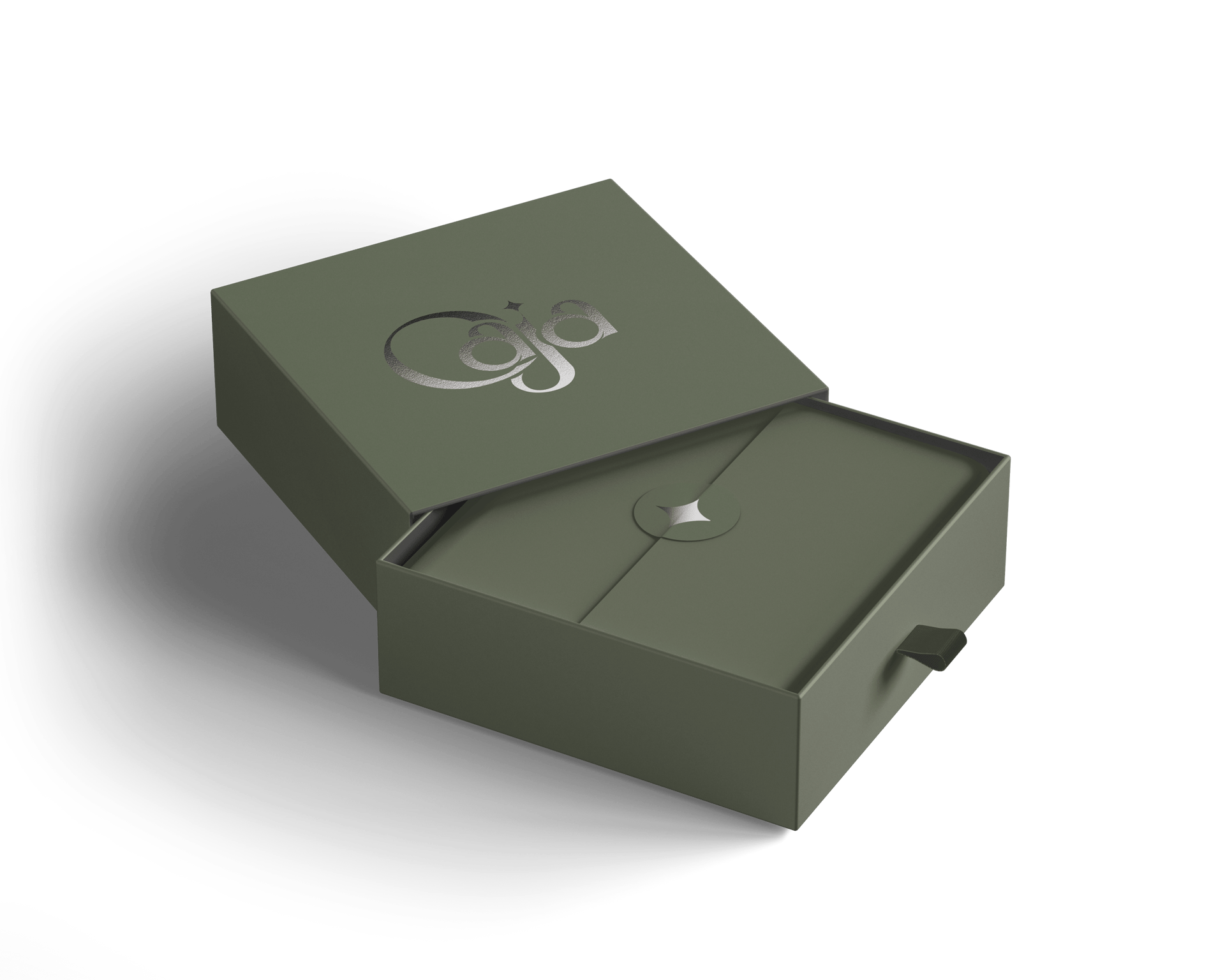
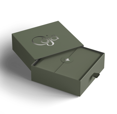
The name Caja, meaning “jewelry box,” reinforces this intimacy. A jewelry box is not a storefront. It is private space. It holds stories, heirlooms, gifts, promises. Caja positions itself exactly there — at the intersection of memory and material beauty.
The Brief
The Concept
The objective was to create a branding system that communicates value with elegance and emotional depth. The brand needed to feel refined yet accessible, luxurious yet human. It had to resonate both in physical retail spaces and across digital platforms.
Caja required more than a logo — it required a cohesive identity that could scale across packaging, certifications, social presence, and point-of-sale materials. The design language had to support long-term brand recognition while allowing the jewelry itself to remain the true focal point.
Clarity, warmth, and consistency became the guiding principles.
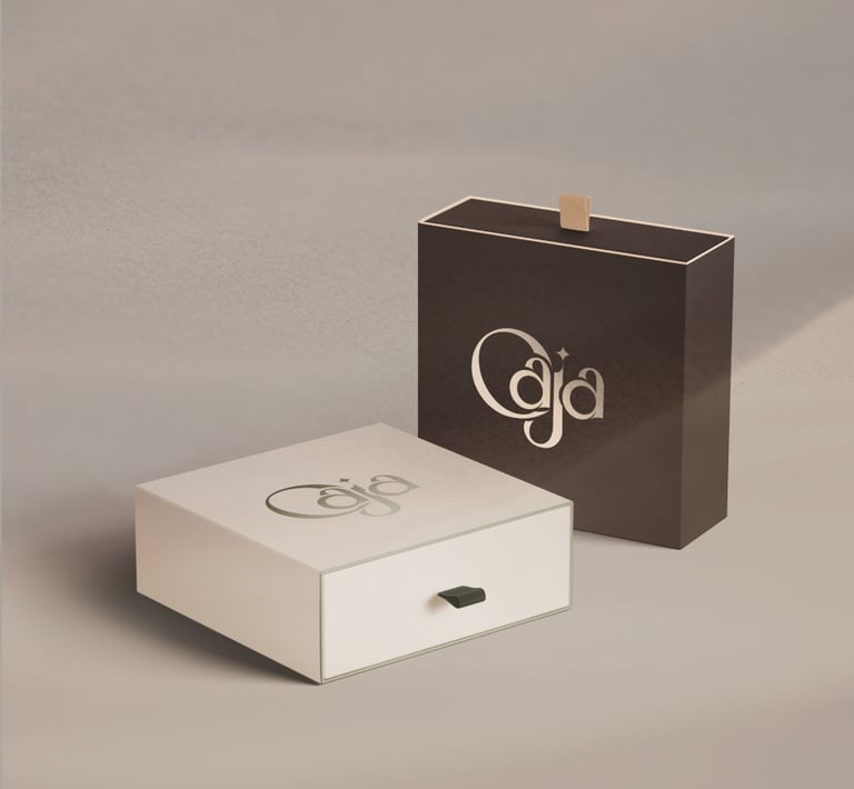
The concept centers around light as a metaphor for discovery. Rather than illustrating the sun directly, we translated its presence into tone and atmosphere. Warm, restrained shades dominate the palette — muted gold, soft beige, warm ivory. These tones suggest the natural glow of sunlight touching metal, creating a feeling of softness and authenticity.
The restrained color direction avoids excess shine and instead creates quiet sophistication. The brand radiates confidence through subtlety. This balance allows Caja to occupy a premium position without relying on visual extravagance.
Light becomes emotional currency — symbolizing value, revelation, and personal treasure.
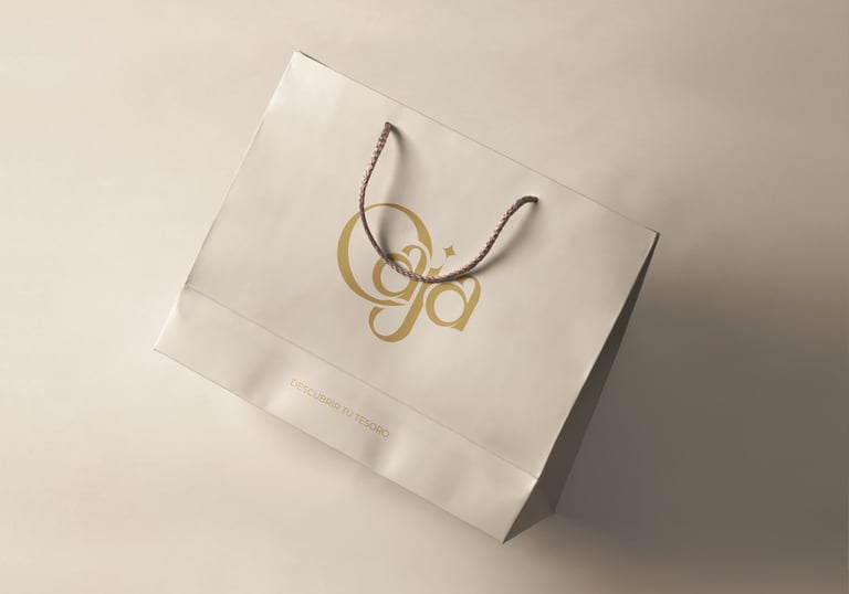
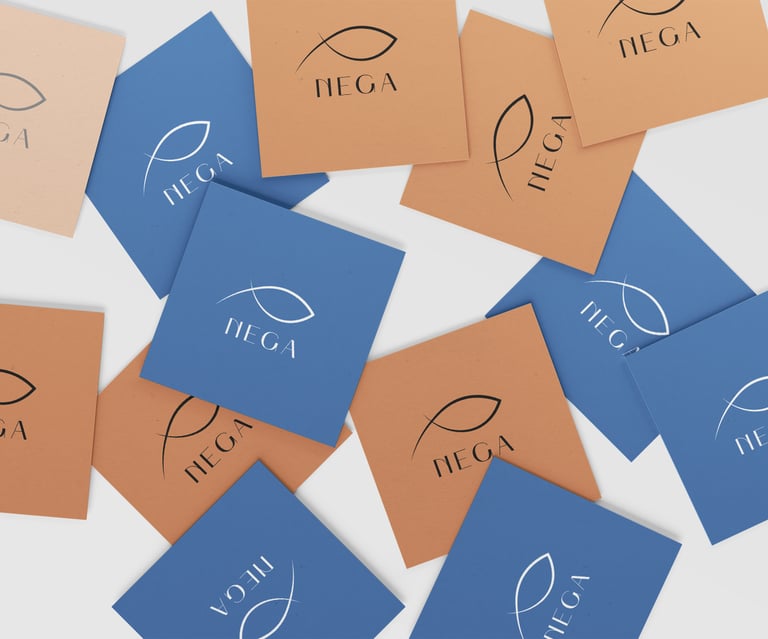
The Logo
Emotional Positioning
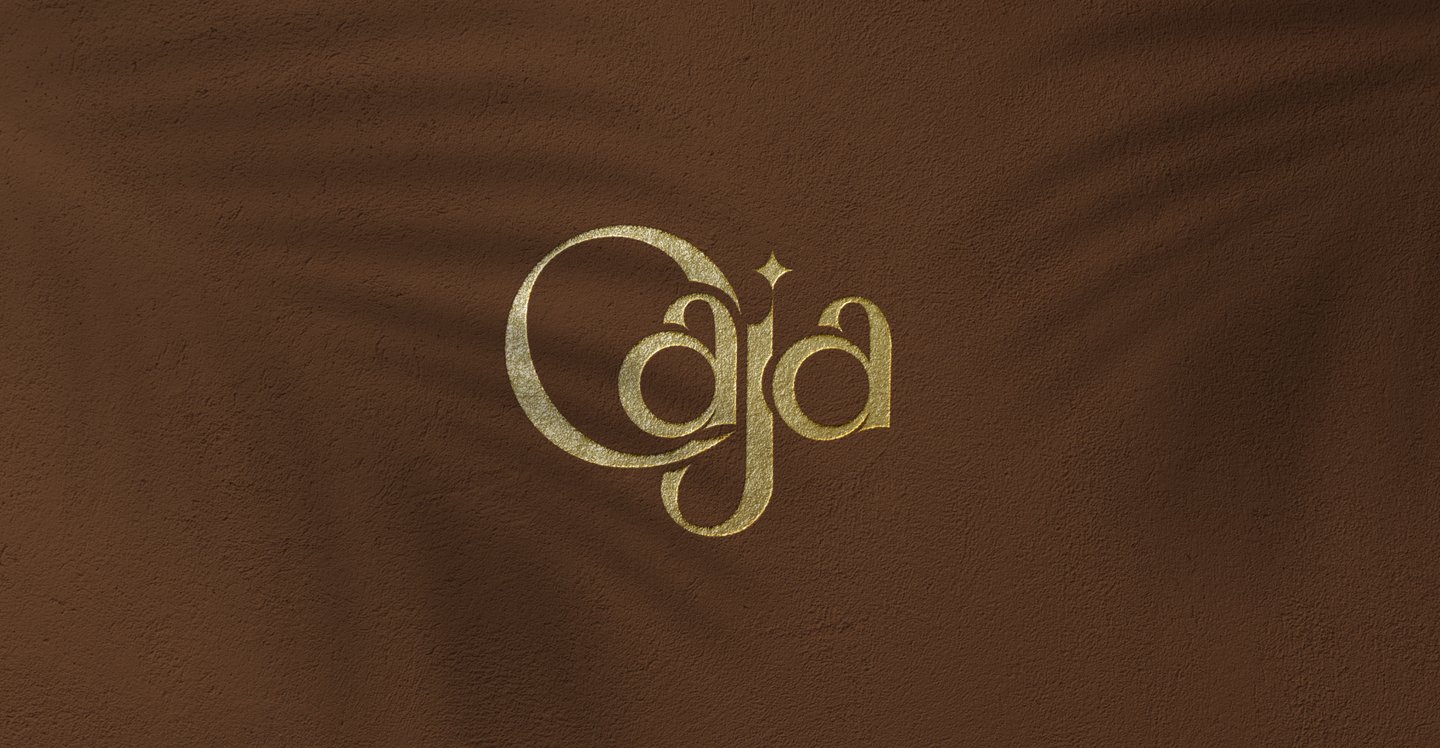
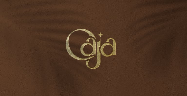
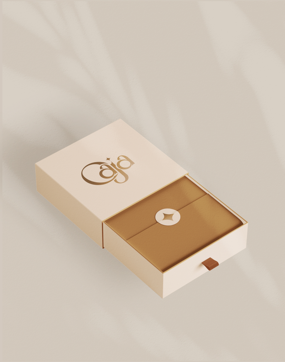
The logo is built around serif lettering that conveys heritage, stability, and craftsmanship. The serif forms are elegant and structured, suggesting tradition and trust, while maintaining softness in proportion to avoid rigidity.
The capital “C” functions as a symbolic gesture. Its open curve subtly references the lid of a jewelry box — the moment just before unveiling something precious. This detail introduces narrative without overwhelming the composition.
The star element, used as a secondary brand symbol, reinforces the idea of rarity and excellence. Across many cultures, a star signifies something exceptional — the highest grade, the rarest find, the most treasured possession. Within Caja’s visual language, it becomes a quiet signature of value.
Together, typography and symbolism create a logo that feels composed, timeless, and meaningful.
Caja positions jewelry as a personal treasure rather than a decorative accessory. Each piece is framed as something to be discovered, chosen, and kept close. The brand language speaks to individuals who value meaning as much as aesthetics.
The motto “Discover Your Treasure” transforms the buying process into an intimate experience. It invites curiosity and emotional engagement. The act of opening a Caja package becomes symbolic — a moment of revelation, similar to lifting the lid of a jewelry box for the first time.
This emotional dimension creates a strong bond between brand and customer. Caja does not simply sell jewelry; it offers a ritual of discovery.
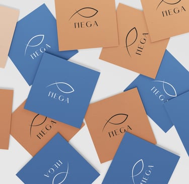
The Brand System
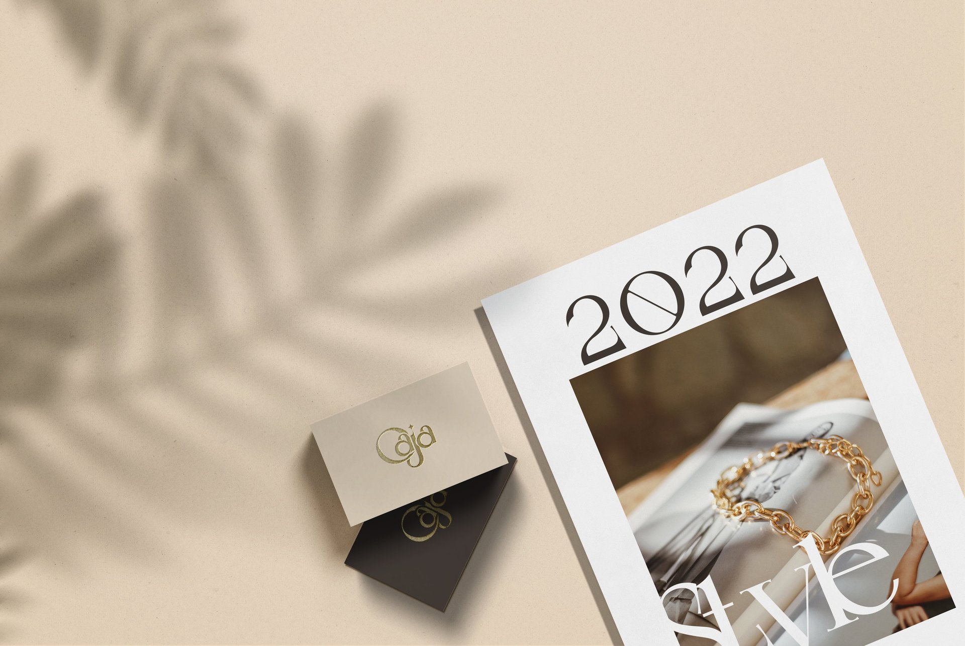
Consistency plays a central role in establishing emotional trust. The typography hierarchy is carefully structured to create breathing space around the logo, ensuring that each application feels refined and intentional. The spacing, alignment, and proportion rules maintain visual discipline across every format.
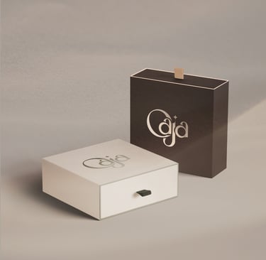
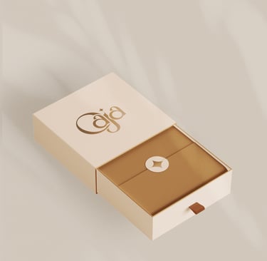
Packaging materials further reinforce the brand’s warmth. Matte surfaces paired with delicate gold accents create a tactile contrast between softness and brilliance. This interplay mirrors the jewelry itself — smooth metal, radiant surface, delicate craftsmanship.
Whether on a shopping bag, certificate card, or digital banner, the brand identity maintains the same controlled elegance. The result is a cohesive system where each element supports the other, strengthening recognition and memorability.
The Outcome
Caja now stands as a Spanish jewelry house defined by warmth, refinement, and symbolic depth. The visual identity aligns seamlessly with the emotional promise of the brand — luminous yet composed, elegant yet inviting.
Through a consistent and thoughtfully structured design system, Caja establishes long-term recognition and trust. The brand language supports growth while maintaining its core narrative of light, treasure, and intimacy.
Caja becomes more than a name.
It becomes a feeling — a quiet glow carried close to the heart.


Ready to shape your visual identity?
© 2026 Leap Weasel