
The Architecture of Brand Identity
branding studio, brand identity, visual identity, brand strategy, logo design, custom typography, type design, visual systems, album cover design.
On Strategy, Typography, and the Discipline of Enduring Form
In every age, commerce has required recognition. Yet recognition alone does not constitute identity. A true brand identity is not a signal shouted into the marketplace; it is a structure erected with care, capable of bearing meaning over time.
Leap Weasel, as an independent branding studio, approaches identity not as decoration, but as architecture. Form is not applied — it is reasoned. Visual expression does not precede thought; it follows it.
This study sets forth the principles by which enduring visual identity is composed: through brand strategy, disciplined structure, considered logo design, and custom typography shaped to serve clarity and continuity.
No structure stands without foundation. In the practice of branding, that foundation is strategy.
Brand strategy concerns itself with position, intention, and distinction. It defines the nature of a company, its place within a cultural or commercial order, and the values it seeks to embody. Without such clarity, visual identity becomes ornament without purpose.
In our method, brand strategy precedes all graphic decisions. We examine:
The purpose of the enterprise
The audience it addresses
The cultural environment it inhabits
The long-term ambition it pursues
Only when these matters are defined may identity be shaped.
A branding studio that begins with color or symbol without strategic examination risks producing an image that attracts momentary notice yet fails to sustain recognition. Strategy grants coherence; coherence grants authority.
I. On Brand Strategy as Foundation


The common error in logo design lies in mistaking the mark for the whole.
A logo, though central, is but one element in a broader visual identity system. True identity comprises typography, color discipline, spatial hierarchy, proportion, and rules governing application across mediums.
A visual system must answer the following:
Can it adapt without distortion?
Can it remain recognisable across print and digital contexts?
Does it possess internal logic?
At Leap Weasel, visual identity is composed as a system governed by structure. Grids are established. Hierarchies are defined. Negative space is treated as deliberately as symbol.
Such restraint ensures that the brand remains legible in growth and dignified in scale.
II. On Visual Identity as System, Not Emblem


Logo design, when approached with seriousness, resembles the drafting of a seal or crest: a mark capable of representing an entire enterprise through distilled form.
The construction of a mark demands proportion. Geometry, spacing, and alignment must be examined with discipline. A logo that appears simple often conceals extensive refinement.
We consider:
Balance between positive and negative space
Optical corrections in curves and angles
Scalability without loss of integrity
Contextual use within broader brand identity
The aim is not novelty for its own sake, but inevitability. The finest marks appear as though they could not have been otherwise.
III. On Logo Design and Proportion

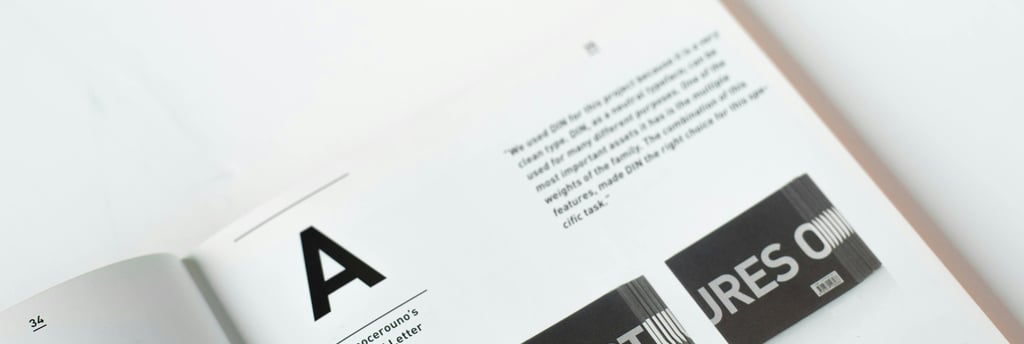
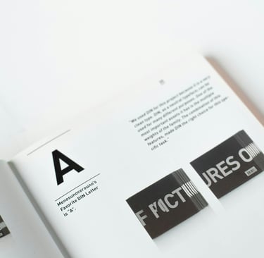
Typography is the most constant element of brand expression. Images may vary; campaigns may shift; yet letterforms persist.
For this reason, custom typography and type design occupy a central place in our practice.
A bespoke typeface grants a brand distinction that cannot be replicated through common fonts. It governs tone before a single word is read. Serif construction, stroke contrast, spacing rhythm — these matters determine whether a brand speaks with confidence or hesitance.
In developing custom fonts, we study:
Historical typographic lineage
Cultural resonance of form
Legibility across sizes and screens
Harmony with the broader visual identity
Typography is not embellishment. It is architecture rendered in language.
IV. On Typography and the Visible Voice

Modern design often mistakes abundance for strength. Yet abundance obscures hierarchy, and hierarchy is essential to clarity.
Refinement consists in removal. Through disciplined editing, excess is eliminated, leaving only what serves meaning.
In branding, refinement may require:
Simplifying a symbol
Reducing a color palette
Adjusting typographic weight
Clarifying spacing and alignment
This stage demands patience. It is here that authority emerges.
A branding studio devoted to refinement does not seek to impress through spectacle. It seeks to endure through proportion.
V. On Restraint and Refinement


Where music and culture are concerned, visual identity assumes narrative dimension.
Album cover design must translate sound into form without imitation. It must evoke tone, atmosphere, and intention while remaining composed and structurally sound.
In such works, brand identity principles still apply: hierarchy, typographic clarity, and proportional balance govern even expressive compositions.
Cultural projects benefit from the same discipline as corporate brands. Form must carry meaning beyond a single season.
VI. On Album Cover Design and Cultural Expression

A brand today exists simultaneously across websites, printed materials, packaging, and digital interfaces. Continuity across these environments requires system thinking.
Visual systems must anticipate adaptation:
Responsive digital layouts
Scalable logo applications
Print and packaging translation
Social and editorial consistency
Brand identity that lacks system discipline fractures under expansion. Identity that is structured endures growth.
VII. On Consistency Across Mediums

Trends alter rapidly; proportion does not.
The ultimate aim of brand strategy and visual identity is endurance. A composed identity communicates stability, seriousness, and cultural awareness.
Authority is not declared. It is perceived through coherence.
Leap Weasel exists to cultivate brands capable of sustained presence — enterprises whose visual language reflects intention rather than impulse.
VIII. On Endurance and Authority

A branding studio serves not merely as designer, but as custodian of coherence.
It must mediate between ambition and structure, between creativity and discipline. It must ask not only what appears striking, but what remains consistent.
Through integration of brand strategy, logo design, custom typography, and visual systems, we ensure that every element serves the whole.
IX. On the Role of the Branding Studio

In the architecture of brand identity, reason precedes ornament. Structure precedes expression. Discipline precedes recognition.
When strategy is sound, when typography is considered, when logo design is proportioned and refinement complete, identity becomes durable.
Such brands do not seek attention; they command it quietly.
Conclusion: Form Guided by Reason


In a time inclined toward haste, we choose deliberation.
In an environment of noise, we choose order.
Forma est ratio visibilis.
Form is reason made visible.
© 2026 Leap Weasel