
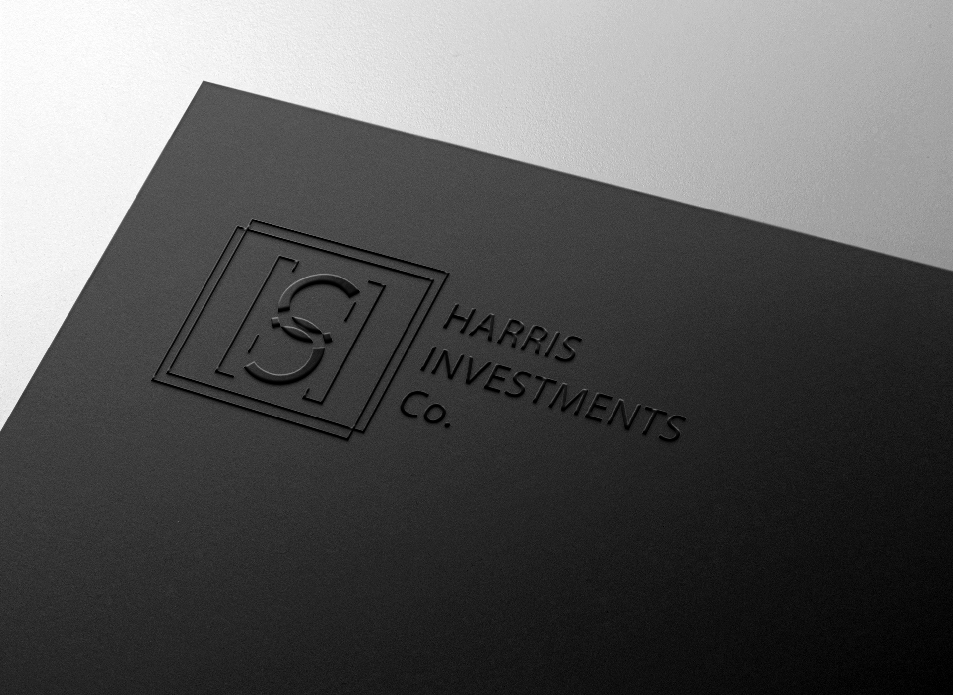
Harris Investments
Strategic Advisory
Long-Term Partnerships
Capital Intelligence
Guiding Capital with Clarity
The Architecture of Trust
In the financial world, clarity is currency. Before numbers are evaluated and portfolios are structured, perception establishes credibility.
Harris Investments required a visual identity capable of reflecting intellectual rigor, structural discipline, and long-term strategic thinking.
The challenge was to create a brand language that communicates stability without appearing rigid, and intelligence without appearing distant. The firm positions itself not merely as an investment vehicle, but as a strategic partner — one that guides clients through complexity with analytical depth and measured foresight.
The identity had to embody that balance: strength and neutrality, connection and direction.

The Brief
The Monogram Concept
The objective was to design a brand system that would:
Express partnership and mutual alignment.
Convey discipline, objectivity, and structural reliability.
Function seamlessly across digital and corporate environments.
Reinforce the company’s mission of guiding clients through multifaceted financial landscapes.
This required a visual language rooted in geometry and symbolism rather than ornamentation — a system where every element carries conceptual weight.
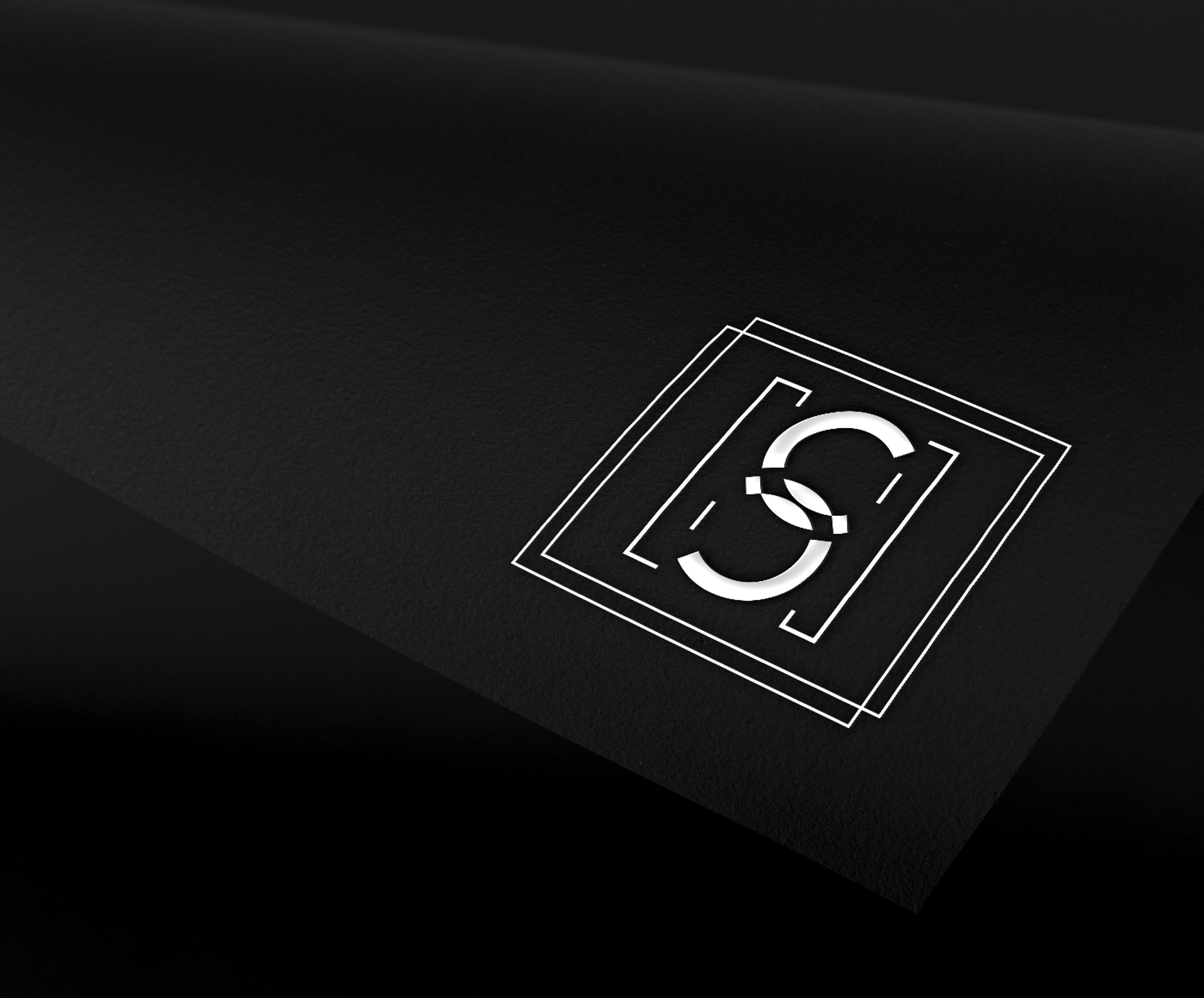
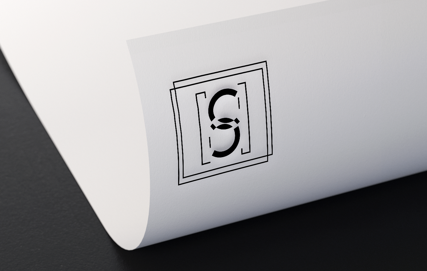
At the heart of the identity lies the integration of the letters “H” and “S” — the first and last letters of Harris. Rather than treating these initials as separate typographic elements, they are interwoven into a single cohesive structure.
The resulting form subtly resembles interconnected chain links. This reference is deliberate. A chain symbolizes solidarity, durability, and interconnected strength — values that mirror the firm’s approach to partnerships. Investment strategy is built on alignment, collaboration, and shared long-term objectives. The linked structure visually reinforces that philosophy.
The monogram operates as both symbol and statement: strength through connection.


Geometric Framework
Typography & Composition
The interlocked initials are positioned within two square forms. The first square represents Harris Investments. The second represents the client. Their mirrored geometry establishes visual parity — a balanced relationship rather than a hierarchical one.
The square itself carries layered meaning. It communicates stability, rigor, neutrality, and respect for structure. In financial advisory, discipline is fundamental; the square reflects that analytical foundation.
Symbolically, the square also evokes the four cardinal directions of a compass. This metaphor connects directly to the firm’s mission: providing orientation within complex financial environments. Just as a compass guides movement through physical space, Harris Investments guides its partners through strategic decisions, risk assessments, and diversified options.
Geometry becomes narrative.
Structure becomes guidance.
The typographic system supports the brand’s structural precision. Clean, modern letterforms communicate clarity and professionalism. Generous spacing allows content to breathe, reinforcing transparency and confidence.
Grid-based layouts dominate both print and digital materials. This disciplined alignment system ensures consistency across presentations, proposals, business cards, and online platforms. The visual rhythm mirrors the analytical frameworks used in investment strategy — measured, balanced, deliberate.
Every compositional decision reflects order and intentionality.


Color & Visual Tone
The brand palette is intentionally restrained, built around gradients of gray — from deep charcoal to refined white. This monochromatic direction references the aesthetic of financial journalism, editorial publications, and analytical reports.
Grayscale creates a timeless and authoritative atmosphere. It emphasizes clarity of form, sharp contrast, and typographic hierarchy. By removing chromatic distraction, the brand reinforces neutrality and objectivity — essential qualities in financial decision-making.
The absence of bold color statements strengthens the perception of rationality and long-term thinking. The identity feels enduring rather than trend-driven.
Digital Experience — One Page Structure
The brand extends into a One Page Website architecture — a contemporary format that emphasizes clarity and direct communication. This structure allows visitors to navigate the firm’s expertise, philosophy, and contact information within a continuous, intuitive flow.
The vertical sequence is carefully structured to guide attention progressively, mirroring the firm’s advisory process: understanding context, evaluating options, defining direction.
Both desktop and mobile interfaces adhere to the same principles: minimal interface elements, strong typographic hierarchy, and controlled use of space. The digital environment prioritizes essential information while maintaining visual authority.
The experience feels structured yet accessible — strategic yet human.
Design Philosophy
This project is grounded in a simple but powerful principle: clarity builds confidence.
Rather than relying on decorative elements, the identity communicates through geometry, proportion, and symbolism. The interlinked monogram expresses partnership. The square expresses stability and direction. The grayscale palette expresses neutrality and discipline.
Together, these components form a cohesive brand ecosystem that aligns with the firm’s mission: guiding partners toward intelligent, sustainable investment decisions.
Harris Investments now communicates through structure.
Through alignment.
Through direction.
A brand identity designed not to impress momentarily — but to endure strategically.


Ready to shape your visual identity?
© 2026 Leap Weasel